UX design methods, part 1
A step-by-step guide to user journey maps — a low-cost method for creating nonprofit websites that helps visitors find what they need and take action.
When I was the communications lead for the launch of the Accountability Framework initiative (AFi), we faced a common, but nonetheless daunting challenge: Getting a diverse group of stakeholders interested in a complex idea.
The AFi came together to create principles and guidance for companies to eliminate environmental and human rights issues from their supply chains. The AFi entered a crowded space, with dozens of tools, certification standards, and guidelines about ethical supply chains already competing for attention. But that was part of the problem — there were so many tools and platforms, often promoting conflicting ideas, that it was easy to be confused on what “good” looked like.
While companies were the primary target audience, we also needed to convey the value of the Framework to industry groups, governments, civil society organizations, and communities.
Each of these groups have very different perspectives and interests. How could we design a website that got each of them interested in this upstart Framework — and guided them to action?
Ultimately, this is the fundamental challenge of website information architecture.
This article is the first in a series looking at user experience design techniques to improve mission-driven websites. I’ll share the methods we employed to create an intuitive and user friendly website navigation for the AFi. In this first article, we’ll look at user journey diagrams. This method requires relatively low effort but will help you dramatically improve the user experience of your nonprofit website.
But first, let’s talk about the flip side: unintuitive and unhelpful user experience.
Design by committee
Many mission-driven websites suffer from the classic “design-by-committee” problem. The website is designed for various divisions within the organization — NOT for its audience.
I used to describe this as the “government website problem,” because so many government websites fail in their primary purpose: delivering the right information to the right people. The homepage of the site would be packed wall-to-wall with details about every imaginable activity at every department in the government office. But then it would require dozens of clicks to find basic pieces of critical info. How do you pay utility bills? Where can you apply for benefits? How do you track down records like birth certificates?
It’s not just governments though. We see this issue constantly with nonprofits as well. Nonprofit websites often feature all the latest reports, press releases, thought pieces, and events people in the organization have attended — but make it frustratingly hard to find things like how to donate, simple and clear demonstration of impact, or how to get involved.
Every team, group, division, or department in the organization jockeys for space to promote their work. However, in doing so, they forget about the needs of the target audience.
Let’s look at a powerful method for shifting from design-by-committee to designed-for-audience.
Chart a clear user journey for your visitors
Creating a user journey map is a relatively low-effort, low-cost method to create sites that are built for your audience, not your committee.
This method can be used individually or as part of a sequence of user experience (UX) design activities. In subsequent articles, we’ll look at other UX techniques, such as card sorting, tree testing, and facilitated usability testing, which can take your user experience to another level.
Part 0: Lay the groundwork with an audience analysis
First things first: All good UX efforts start with a deep understanding of your audience. If you haven’t created audience personas yet, that’s a great place to start. You can do it the traditional way, conducting interviews and then synthesizing insights from those conversations into personas. Or you can take an accelerated approach, working with AI to create hypothesis personas that you can later validate.
However you create them, personas will help ground your website in a person’s day-to-day reality. You can ask, “What are the most important things on our website for this person?”
The answer to that question for each of your personas will help you design effective user journeys — not to mention more targeted messaging, web content, and so forth.
In most cases, I’d say most websites would need three or four personas max. Any more than that starts to create a messy and convoluted architecture, which will likely leave your visitors questioning if this site is for them.
With personas in hand, you’re ready to map out how each one interacts with your site.
Part 1: Identify tasks and barriers for each persona
To start, gather a few people from your organization for some brainstorming, such as program directors or managers who interact directly with your audience. Post up your personas for the team to review. Consider these questions:
- What information matters most to them?
- What actions do we want them to take?
- What will a successful website visit look like for them?
- What would they likely find frustrating or difficult?
The insights you generate from these questions will help you map out the user journeys. Follow these general steps to get started:
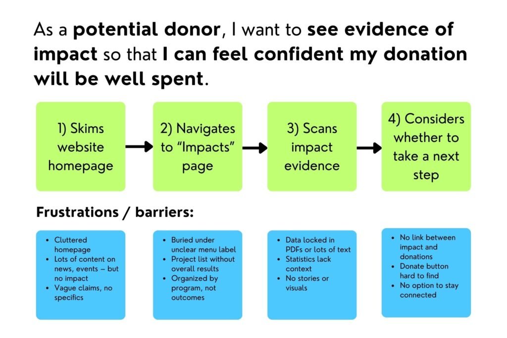
- Identify one to three primary use cases for each persona. What specific task would they want to accomplish on your website? Use the prompt, “As a [PERSONA], I want to [TASK] so that I can [ACHIEVE BIGGER PICTURE GOAL].” For example, “As a foundation program officer, I want to find the nonprofit’s annual report so that I can present justification for further funding.”
- For each use case, map out the steps they need to take to complete the task. If you’re in person, you can use post-it notes to write specific tasks and the webpages or sections on pages they need to visit. If you’re working virtually, you can use a virtual whiteboard, PowerPoint, or other tool. The main idea is to document each action they need to complete to achieve their goal.
- Consider the potential barriers or frustrations. What might be hard or frustrating for them? What technical issues might slow them down? For example, if they have to click through too many pages, they’ll likely get annoyed and give up.
Follow this process for each use case for each persona. You’ll likely have something like this:
Part 2: Define the journey’s phases
Typically, a user journey map is broken up into phases: marching a visitor from initial awareness to taking an action.
Most of the examples of user journey maps you’ll find out there are designed for businesses. As such, the phases are typically leading towards a purchase. So in the for-profit world, you might see something like:
Awareness → Consideration → Decision → Purchase → Retention
While the “Awareness” phase still relates to mission-driven work, there are likely other approaches that will be more relevant to your organization. For example, you might consider something like:
Awareness → Understanding → Action → Deepening → Championing
This breakdown of phases would lead a prospective supporter from learning about your organization to taking action (e.g. making donations) to becoming an ardent supporter.
Naturally, this isn’t the only approach. There are various ways you might structure your journey phases — and it might be slightly different for each of your different personas. So you’ll likely want to experiment with a breakdown of phases that works for you.
Part 3: Create the maps
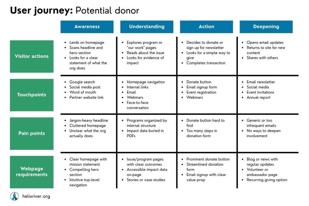
Once you have arrived at a logical progression for your users’ journey, the final action is to map out the use cases and steps from Part 1 to the phases in Part 2:
- Map use cases and specific user actions in each phase. For each phase, what are the key actions a visitor needs to take? In the each phase, what information do they need most? What actions would they most likely take? Now that you see the actions mapped out against the full journey, what’s missing? For example, in the foundation program officer example above, if they’re looking for an annual report, they’re well advanced in the journey. They’re looking to deepen their support or maybe even become champions for your work.
- Reassess and define the barriers. Looking at your site visitors’ actions through the lens of this broader user journey, are there other potential frustrations or barriers?
- Identify webpage resource requirements. Now that you have a better sense of what they need to see and do, what webpages or interactions are necessary? How can you make sure they can achieve each of the tasks?
Here’s an example of a completed user journey diagram:
You can adapt this approach to suit your needs and context. But this should give you a solid framework to understand and map out how your audience members have meaningful interactions with your website.
At the end, you’ll have a set of actionable user journey diagrams to inform creating a user-friendly website structure. You can use these diagrams to design or restructure your website navigation and information architecture.
Build a foundation now, save headaches later
Depending on your resources and time, you might dive head first into a full-blown UX design process. Or you might take the UX Lite approach, creating a handful of minimalist user journeys.
We followed a streamlined version of this approach to build the Accountability Framework website. With some simple user journeys and other UX testing methods we’ll cover in future articles in this series, we helped transform the user experience — and perception — of the AFi. When we started, few people in the field understood the value of yet another initiative. After we launched the site with some clearly defined user journeys for specific personas, our audience started coming around. Today, the AFi serves as a standard approach for ethical supply chains. And the information architecture we built several years ago still follows a similar logic.
Given the typical budget and resource constraints for nonprofits, you might get some pushback on the idea of doing this kind of user experience design work. We frequently feel strong pressure to just get started and make the thing already.
But rushing the process — and skipping this effort to empathize with your audience — comes with major risks. For one, your visitors will get frustrated by a confusing user experience and leave your site. Thus you can lose potential supporters. And building a shoddy site today often leads to costly rebuilds not long down the road.
With a minimal investment of time and resources, user journey maps can save you countless hours of pain down the road. By structuring your website around user-centered content, you’ll avoid costly mistakes that can take massive effort to fix.
And most importantly, your site will deliver value to your audience and help achieve your organization’s goals.