Learn practical design principles that will help you make confident decisions about your website — even if you’ve never studied design.
I first learned the power of design while sitting on a park bench in Central Park, NYC. Very early in my career, I was working a temp job and spotted The Non-Designer’s Design Book on an office shelf. I borrowed it, took it to the park, and sat on that bench for hours devouring it. The author, Robin Williams (not the actor, but a designer and educator), distilled fundamental principles of design into four clear, actionable areas.
That book helped lay the foundation for my career in communications — and changed how I look at the world. While I don’t classify myself as a “real” designer, I employ design principles in nearly everything I do. And her book offers a masterclass in communicating complex concepts in practical ways with a clear target audience group of “non-designers.” The fact that I can remember the principles she described over 20 years later speaks volumes about the quality of her communication.
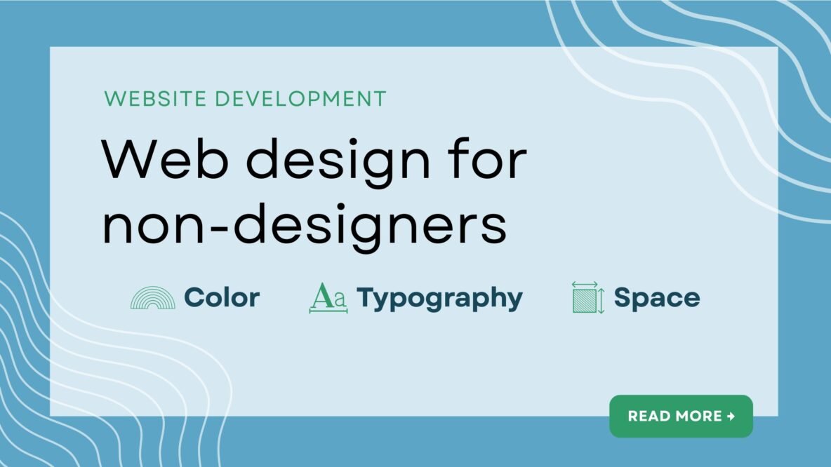
Guided by the spirit of her book, this article presents the basics of three fundamental design principles: color, typography, and space. For nonprofits and other mission-driven organizations whose staff often have to wear multiple hats, understanding these core principles can help you create better websites that more effectively communicate your mission and demonstrate your impact. These principles will also help in planning your website using the Site in Six Days methodology.
Color: Convey the right feelings
Color plays a critical role in how your visitors experience your website. Color carries a lot of emotional weight in a design. Blue signals trust and stability. Green evokes calm. Orange radiates energy. However, these emotional signals also differ by culture and region, so it’s important to research color symbolism for a given community you’d like to reach.
Volumes have been written about color theory and application, but for our purposes here, we can keep it simple. Here are a few principles of color that will serve you in planning your website.
Use only a few colors. Unless you have a compelling reason to use the whole rainbow, it’s recommended to stick with a minimal number of colors. Using too many different colors makes it hard for your readers’ brains to process, as they subconsciously try to make sense of each color.
Typically, good website design will use one main brand color, a secondary color for accents (like buttons or links), and neutral colors (grays, whites, and blacks) for backgrounds and body copy. You can always use different variations of a color hue, with darker shades (mixing black into the color) or lighter tints (mixing in white). That way your designs will feel more cohesive and intentional.
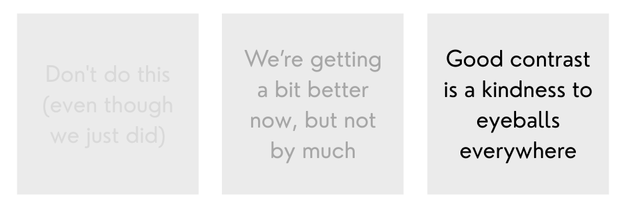
Pay attention to color contrast. The main purpose of a website is to transmit information to our visitors. We want to make that as easy as possible for them. One important factor is the contrast between text and background colors. Light text on a light background (or vice versa) makes the text difficult to read. It will also fail an accessibility check, as users with some visual disabilities will have an even harder time with the low contrast.
We can also use color contrast for visual effect, making a specific element on the page really pop out. For example, we can use our brand accent color on an info box to make it stand out from the rest of the page. Especially when you use that accent color sparingly, it will draw the reader’s attention.
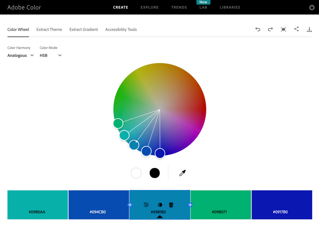
Select colors that harmonize. When selecting colors for your website (and presumably your brand identity), it’s helpful to use tools that show color relationships. One practical tool is Adobe Color, which you can use to select colors based on various kinds of relationships. For example, complementary colors are positioned on opposite sides of the color wheel. This adds high contrast and energy but might feel a bit intense. Analogous colors are positioned closer together on the wheel, which will typically work well together but don’t have as much contrast.
You can also upload an image and the tool will pull out colors. You can then select a couple of the colors to use as your base. For example, if you upload a photo of a mountain sunrise, Adobe Color might pull out a warm terracotta and a soft gold — an instant cohesive palette.
Once you’ve established your color palette, typography becomes your next critical decision.
Typography: Make people want to read
Typography is one of my favorite parts of design. Like color, the selection of a typeface strongly influences the overall user experience of your website. Good fonts are easy on the eye and make people want to read your content. Here are some principles of typography to improve your website.
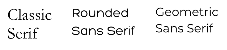
Choose fonts that invite reading. While there are a variety of font families, in most cases you’ll want to use either serif or sans serif. Serif fonts are more traditional, with the decorative strokes on letter forms. Sans serif (literally, “without the serif”) are more modern, with clean and simple letter forms. In the early days of the web, people avoided serif fonts, as they were harder to read on low resolution screens. While screens have improved considerably, many designers still prefer sans serif fonts for the web.
To find the right font, Google Fonts offers thousands of free fonts and an easy filtering system. It also integrates easily into most website platforms.
Optimize for legibility. Many newer typefaces are specifically designed for easy legibility. For example, the font Lexend is “intended to reduce visual stress and so improve reading performance.” Considering how many hours people stare at screens today, providing our visitors with an easier reading experience is a kindness. Other highly legible fonts include Montserrat, Inter, and Noto Sans.
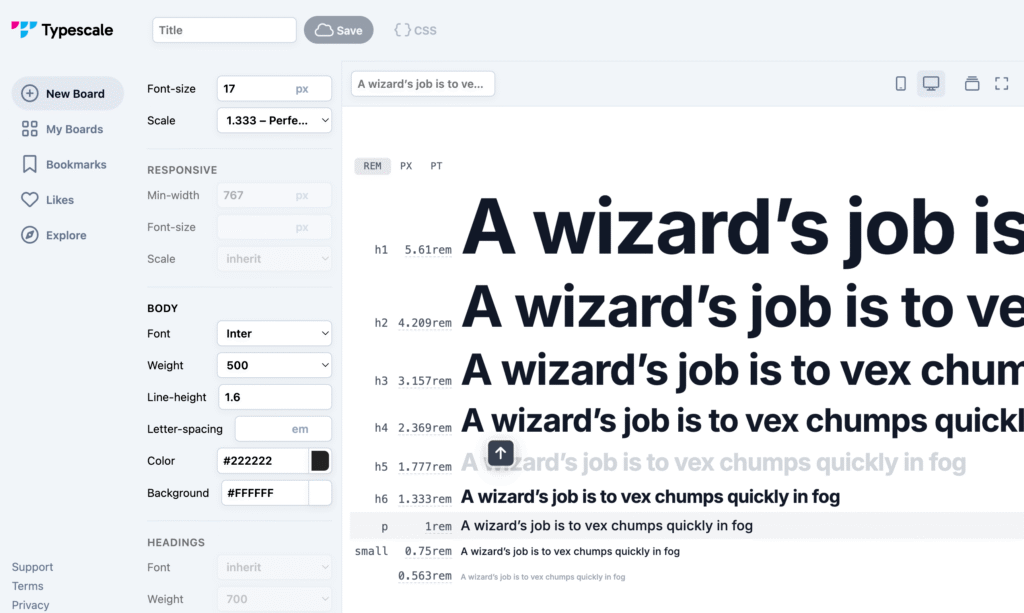
Use type scaling to convey hierarchy. Font sizes influence both readability and perception of importance. Body text should typically be at least 16 pixels to make it easy to read. Another common issue I see on websites is a lack of visual distinction between headings. When your headings are all a similar size, it’s very difficult to assess the level of importance and hierarchy. Each heading should be clearly smaller than its parent heading. Level 1 headings (h1) should be noticeably larger than h2, which should be larger than h3. This creates visual rhythm and helps readers scan content.
You can use a tool like Typescale to establish consistent font sizing. Typescale uses a set of numerical scales to calculate font sizes that convey a clear relationship between each type element. For example, you can select the “Perfect Fourth” ratio, which increases each successive type level by 1.333. So if you start with 16 pixels for the base, the next size up would be 21.3 pixels, followed by 28.4 pixels and so on.
Color and typography work together to convey your messages. But without strategic use of space, even the best color and type choices will feel cluttered.
Space: Let your content breathe
I’ve observed a common tension in mission-driven communications between the space haters and the space embracers. I often see organizations cramming content onto pages, trying to reduce page count. But for the web, this backfires. We don’t gain anything by reducing page count.
I’m very much a space embracer. Whether for the web or other purposes, the use of space makes it easier to scan, absorb, and process information. It can be used for emphasis or creative effect. Space is a powerful design tool.
When we pack our webpages too tightly with text and other content, we’re making our visitors do a lot of mental work. Here are a few principles to help you use space effectively.
Use proximity to communicate relationships. When you position elements closer together, you signal a closer relationship between those things (thanks, Robin Williams, for that lesson!). When elements are further apart, the relationship is reduced. In other words, you can add or remove space between elements to weaken or strengthen relationships. Doing so organizes information logically and reduces cognitive effort for your readers.
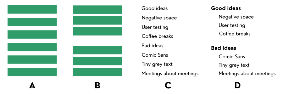
Play in the negative space. The “empty” areas around and between elements is called negative space (aka white space). We are trained to pay attention to the objects around us. But in the context of art and design, negative space is an equal partner to objects. It creates breathing room that makes each element stand out, reducing clutter. It can even be used as a creative design element in itself.
One of my favorite examples of creative use of negative space is the Fed Ex logo. Many of us never noticed that arrow in the logo formed from nothing but space. Once you see it, you can’t unsee it.

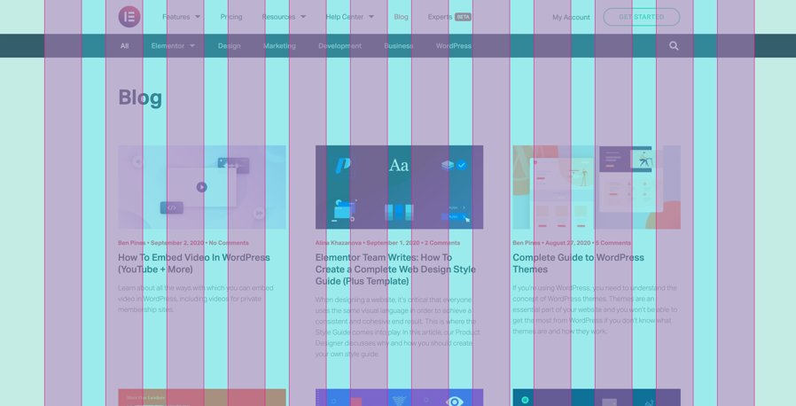
Apply layout grids to control space and position. A common design tool is the layout grid, which creates consistent spacing and alignment across your site. Grids provide structure and hierarchy to your content, while facilitating easy navigation.
Designers use a variety of layout grids, but for the web, we often see 12- or 16-column grids. We’ll set a consistent space between each column in the grid, like 20 pixels (or some other web-based measurement like 1em). And then we can apply content sizes to align with the grid columns using larger widths like one-third (spanning four of the 12 columns) or one-fourth (three of the 12 columns).
The grid makes layout significantly easier. As such, many drag-and-drop website editors like SquareSpace have grid-based layout tools built into the interface.
Design in action
Once you understand color, typography, and space, you’ll start seeing them everywhere. You’ll notice skillful use of harmonized color, typography that makes you want to sing, and spacing that makes you sigh in relief. And then you’ll also notice the opposite: garish color, impossible to read typography, and cluttered layouts.
Even if you never design a website yourself, learning this language enables you to work effectively with designers. You can understand their recommendations and processes. You can evaluate design mockups with confidence and be able to articulate clearly what you like, what you don’t, and why.
And if you’re using the Site in Six Days approach to plan your website, these principles help you make smart decisions quickly. You can choose the right colors, fonts, and design themes to ensure your site serves its audience — and your organization’s goals.
———
Need help planning, optimizing, or building your website? Drop us a line!